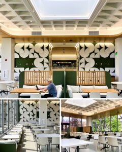
Mid-century design meets 21st century students
University of Cincinnati, MarketPointe Dining Renovation
←
To Project Types
Cincinnati, OH | 22,000 SF
Dining halls can help keep students engaged and provide a sense of belonging and community. It’s important to get students—particularly first-year students—out of their rooms and into spaces where they can connect with peers, build relationships, and feel a sense of well-being.
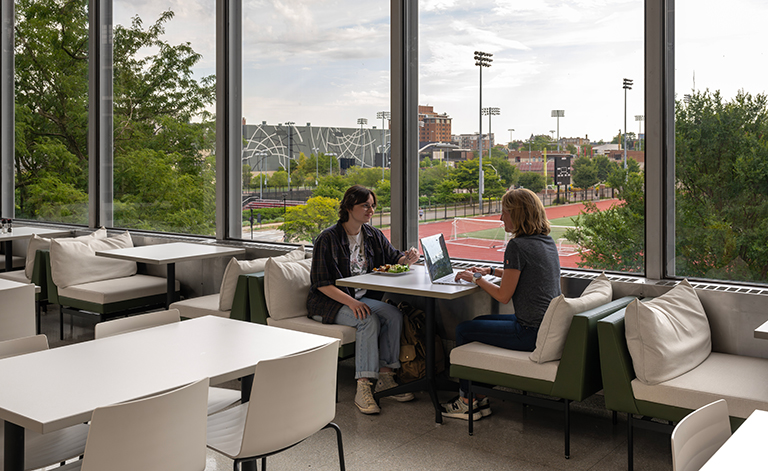 Views out keep students connected to campus.
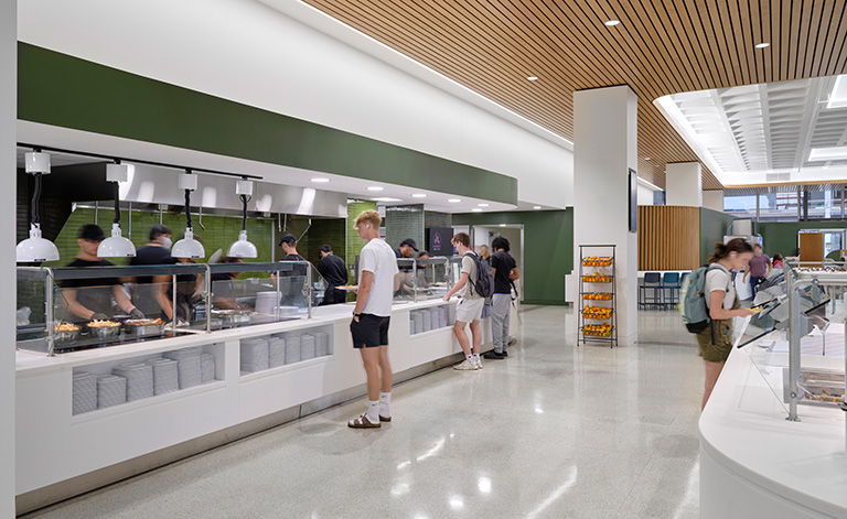 Students can easily access both hot and cold serveries which helps alleviate queuing back ups.
The renovation celebrates the building’s mid-century design DNA by reusing as much original material as possible, including existing terrazzo floors (which had been covered up in a prior renovation) and the concrete waffle slab ceiling. New materials were chosen for durability and sustainability. The upholstery is made of non-phthalate vinyl that is Greenguard gold certified and REACH compliant. It’s non-woven so food and spills won’t get into the fabric and can be easily cleaned. The design takes advantage of the space’s ample daylight, which, in combination with LED lighting throughout, helps the project exceed the Lighting Power Density goal of 68% below baseline.
 Using computational design, we were able to mockup and test our design in collaboration with ADEX International, a local fabricator we engaged to mill, build, and install the feature wall. By leveraging our in-house capabilities and engaging a local partner, we were able to bring a distinctive feature to MarketPointe that might otherwise have exceeded the project budget.
The custom feature wall takes a simple shape—a slightly concave circle—divides it into quarters, and rearranges the quarters into a distinctive pattern that complements MarketPointe's mid-century design DNA.
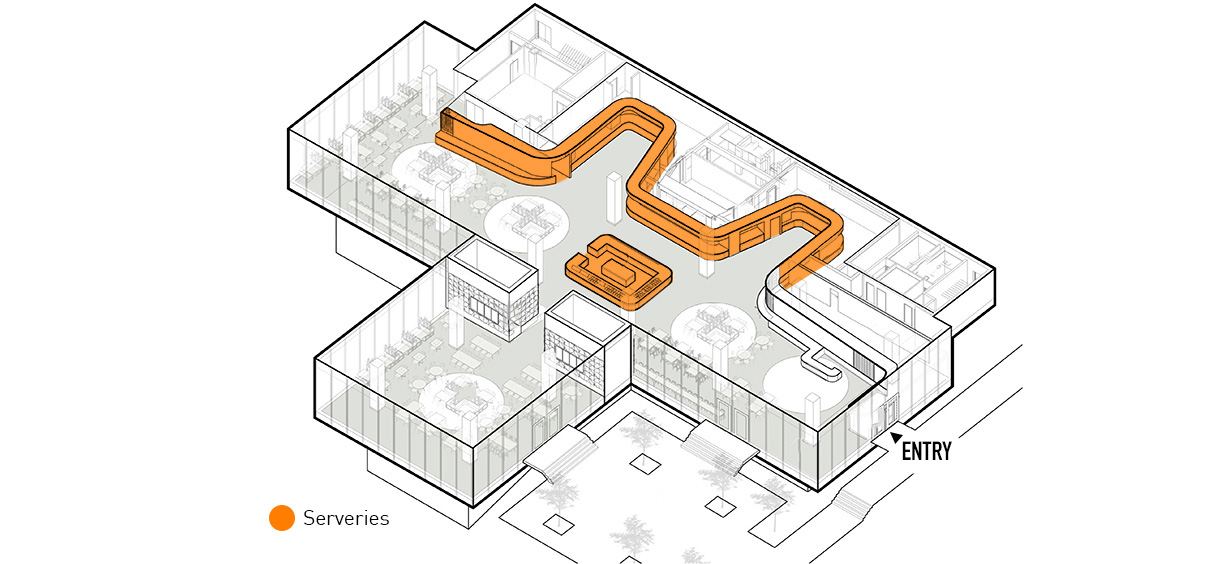 Improving circulation through the dining hall was a priority. Having adjacent hot and cold serveries helps students quickly find what they want.
Most students, but particularly first-year and introverted students, dislike being thrust into the middle of a busy lunchroom. The renovation establishes breathing room as students enter so they can scan the room for familiar faces or, if they’re eating alone, a single spot to eat that doesn’t make them feel on display. Having a servery (rather than seating) in the middle of the room makes better use of a space that students typically avoid. It accommodates expanded menu offerings and alleviates queuing backups at other serving stations.
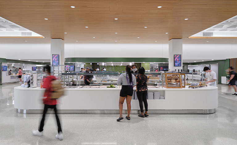 Having a servery in the center of the room is a better use of this space than seating since students tend to avoid sitting in the middle and gravitate to the edges of dining halls.
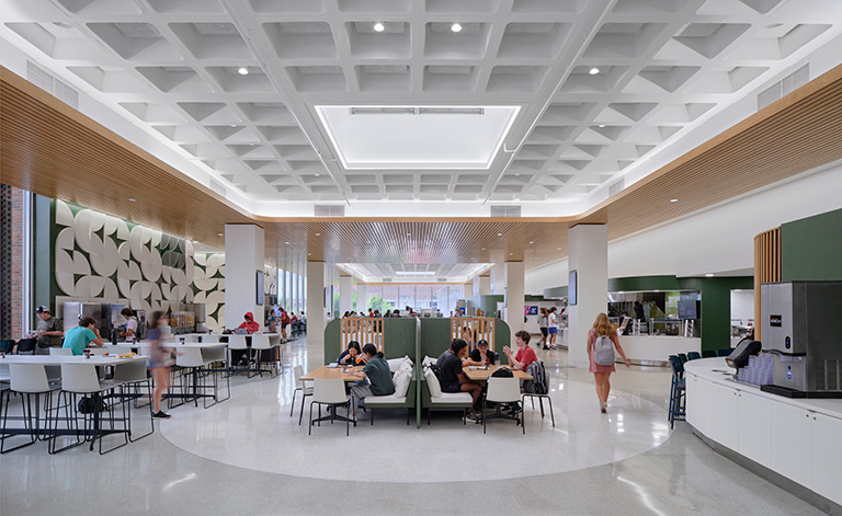 Upon entering MarketPointe, students have breathing room - to scan the room, find friends and approach a bustling space on at their own pace.
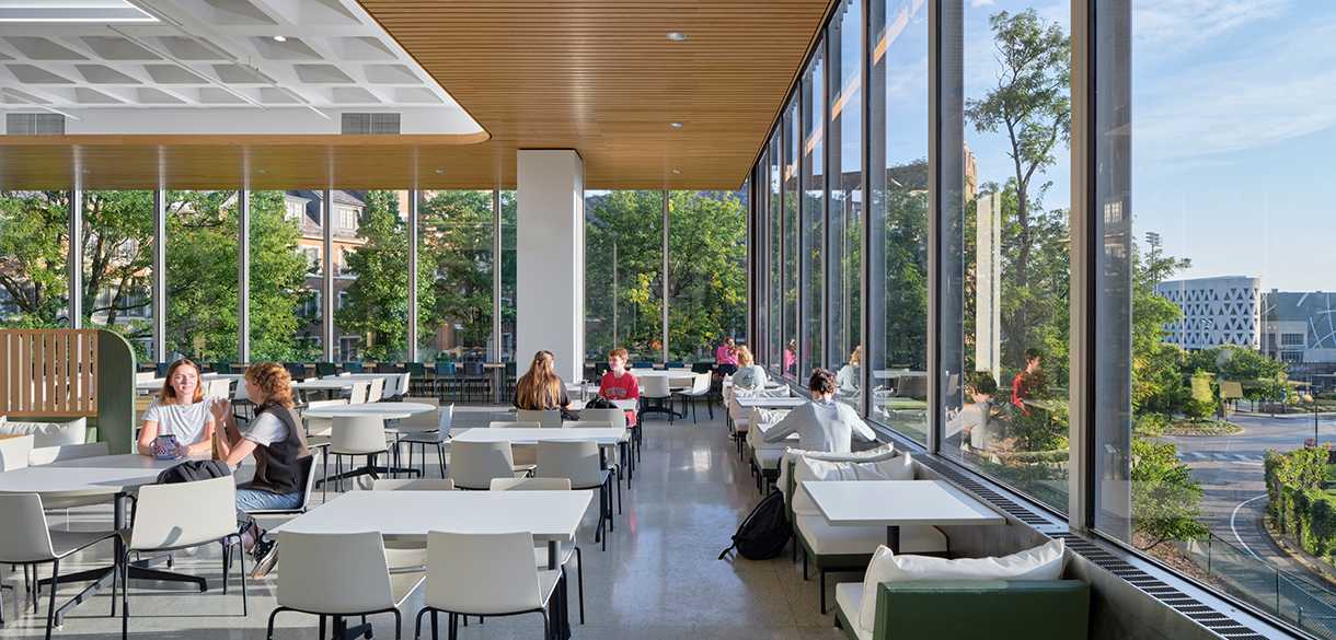 Expansive windows bring in plenty of daylight and lend a treehouse effect to MarketPointe's dining experience.
By understanding the needs of different kinds of students, and finding new life in existing materials, MarketPointe’s renovation brings new options, function, and beauty to an existing campus dining facility.
-
Awards
-
News

AIA Ohio, Interior Architecture, Merit Award


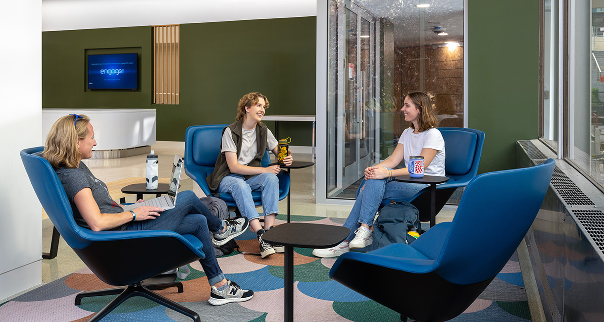 Lounge seating just inside MarketPointe's entry has a relaxed vibe and is a spot to pull over and scan the room for familiar faces.
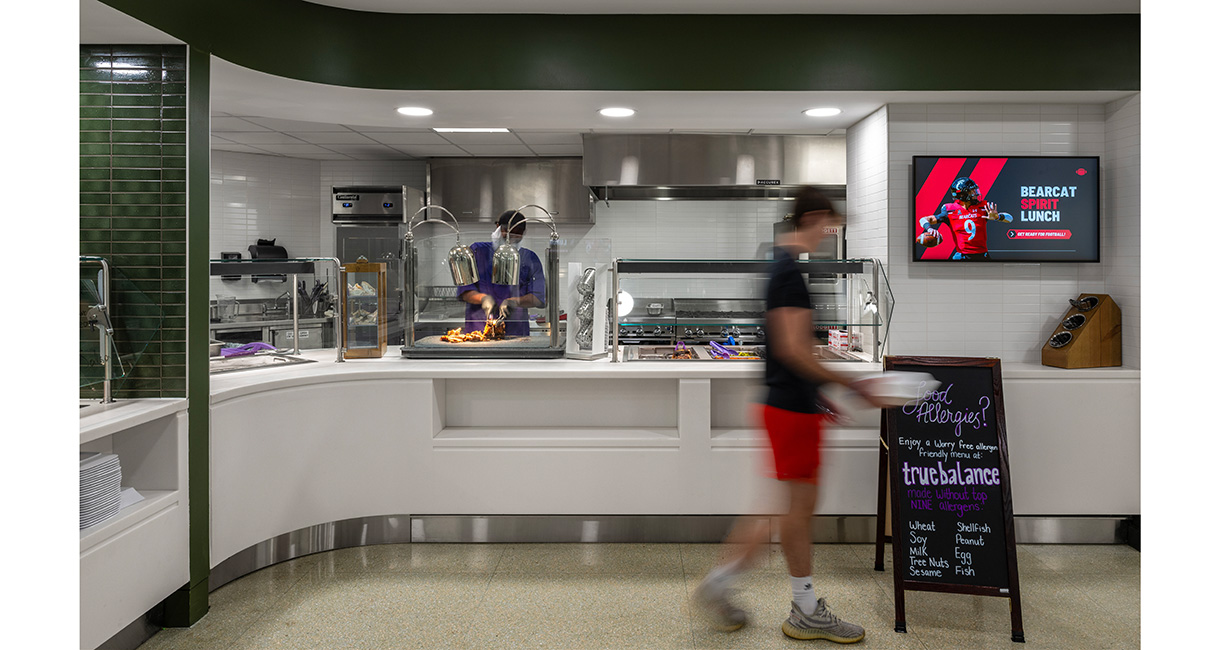 A servery free from the top nine allergens gives students choice and confidence at meal time.
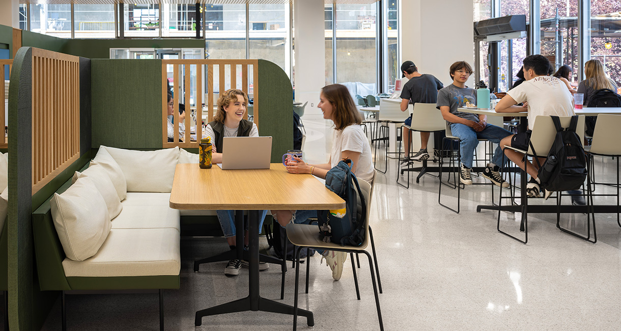 Different seating types accommodate different sized groups as well as different study and socializing styles.
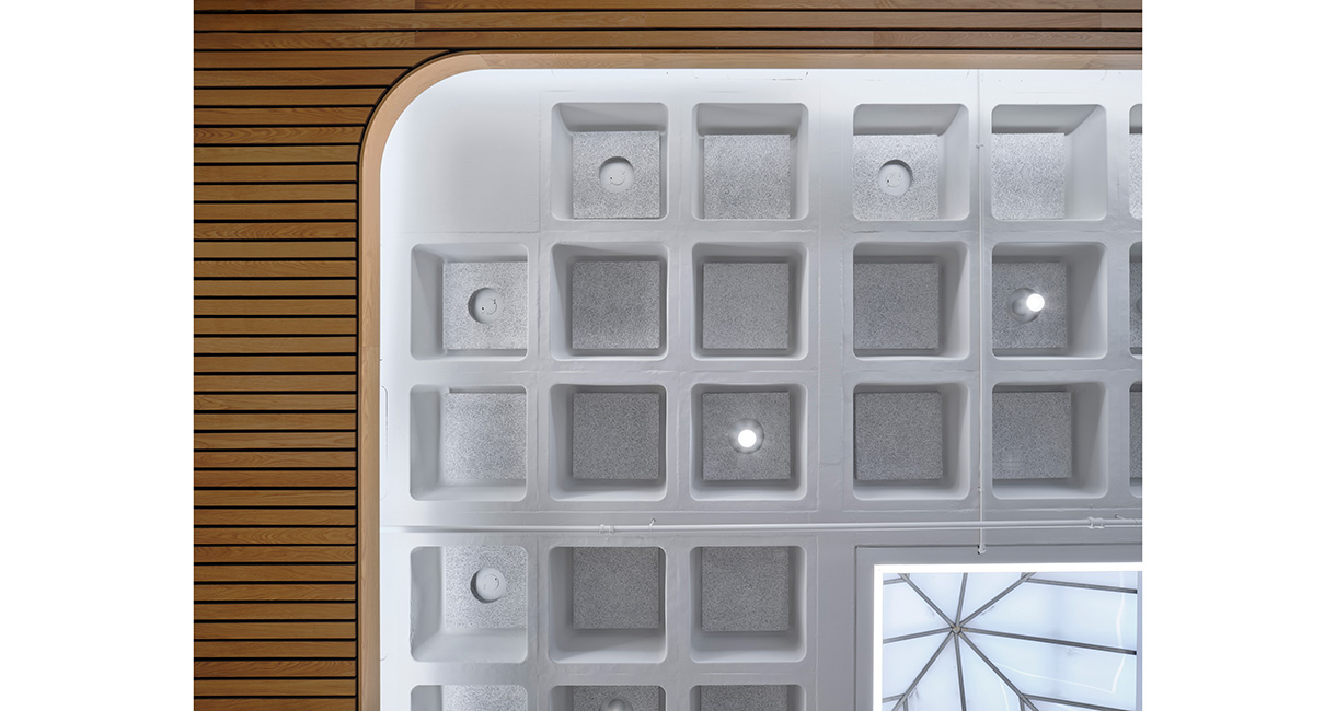 The new wood ceiling brings natural materials into the space while hiding mechanicals that would otherwise distract from the clean, striking geometry of MarketPointe's original ceiling.
