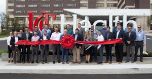
Science As Texture
UC Health Medical Center, Main Entrance Improvements
←
To Project Types
Cincinnati, OH | Canopy & Interior Renovation
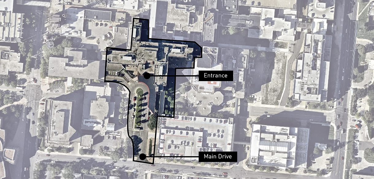 The main entrance to UC Health’s campus is set far back from a high traffic street. A key project goal was to create an entry canopy that could be seen from a distance.
In Science Lives Hope. This is a core belief at UC Health. Nationally ranked as one of the country’s top hospitals, UC Health is also the region’s only Level 1 trauma care center. By surfacing life’s essential building blocks—the hidden textures, lines, and symmetries that can’t be detected by the human eye alone—we helped UC Health physically express their unique brand, their culture of hope, and the power of academic medicine.
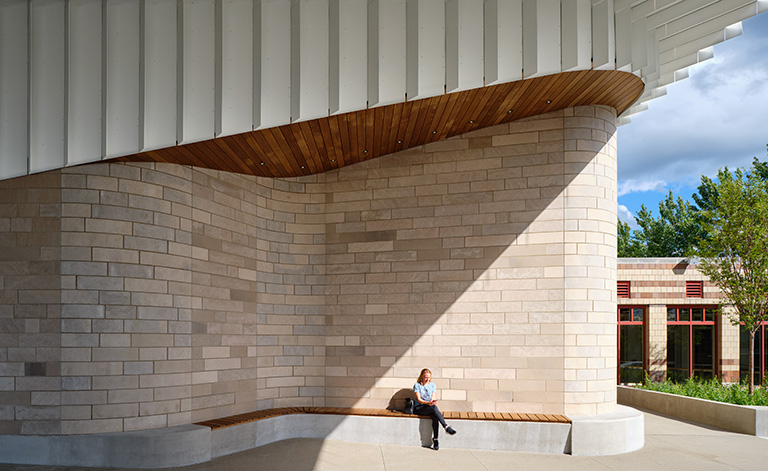 Sheltered from the weather, a built in bench is a welcoming spot to catch a breath of fresh air.
 The distinctive exterior canopy features angled fins, applied at varied spacing and depths. The fin system was designed to minimize custom parts and on-site labor for installation.
For the inaugural project of a system-wide renovation, UC Health put their main arrival under the microscope, and saw an opportunity to enhance the patient experience. A distinctive new entrance canopy clearly defines the campus’ front door, whether people are arriving on foot from the parking garage or driving up to drop off and pick up.
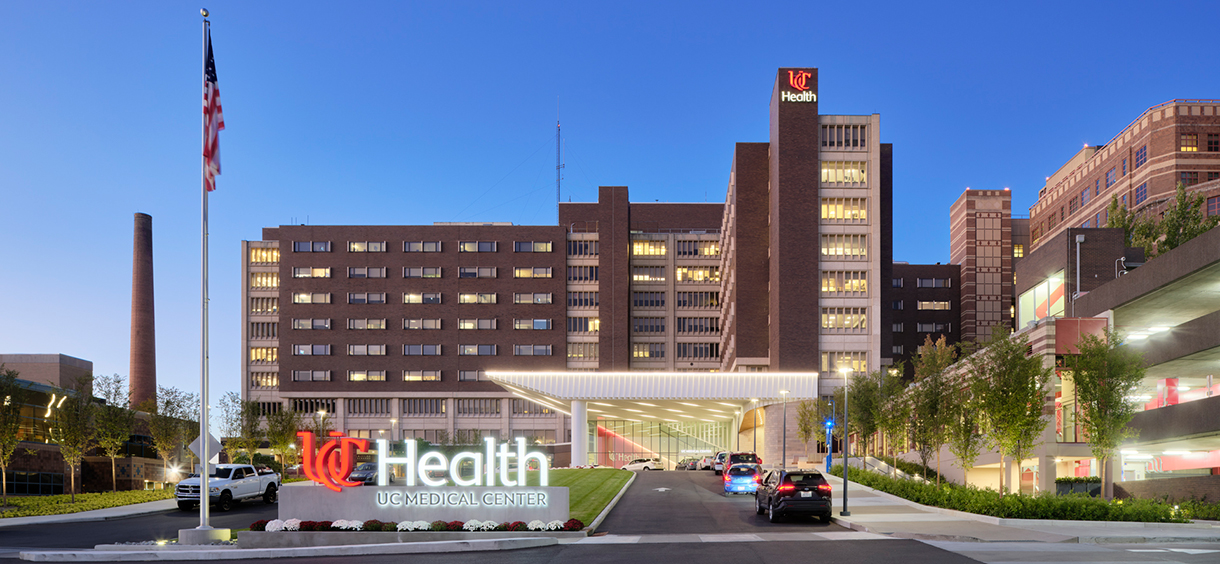 The new arrival design amplifies the entry, making it more visible from the street.
We’ve created a wonderful experience for our patients, families, staff, and community… we now have a world-class environment to match our world-class care.
The canopy’s textures create interest as light changes throughout the day and season. These hidden patterns also inspired the textures used in the ceiling above the information desk as well as on the new grand stair and its overlook.
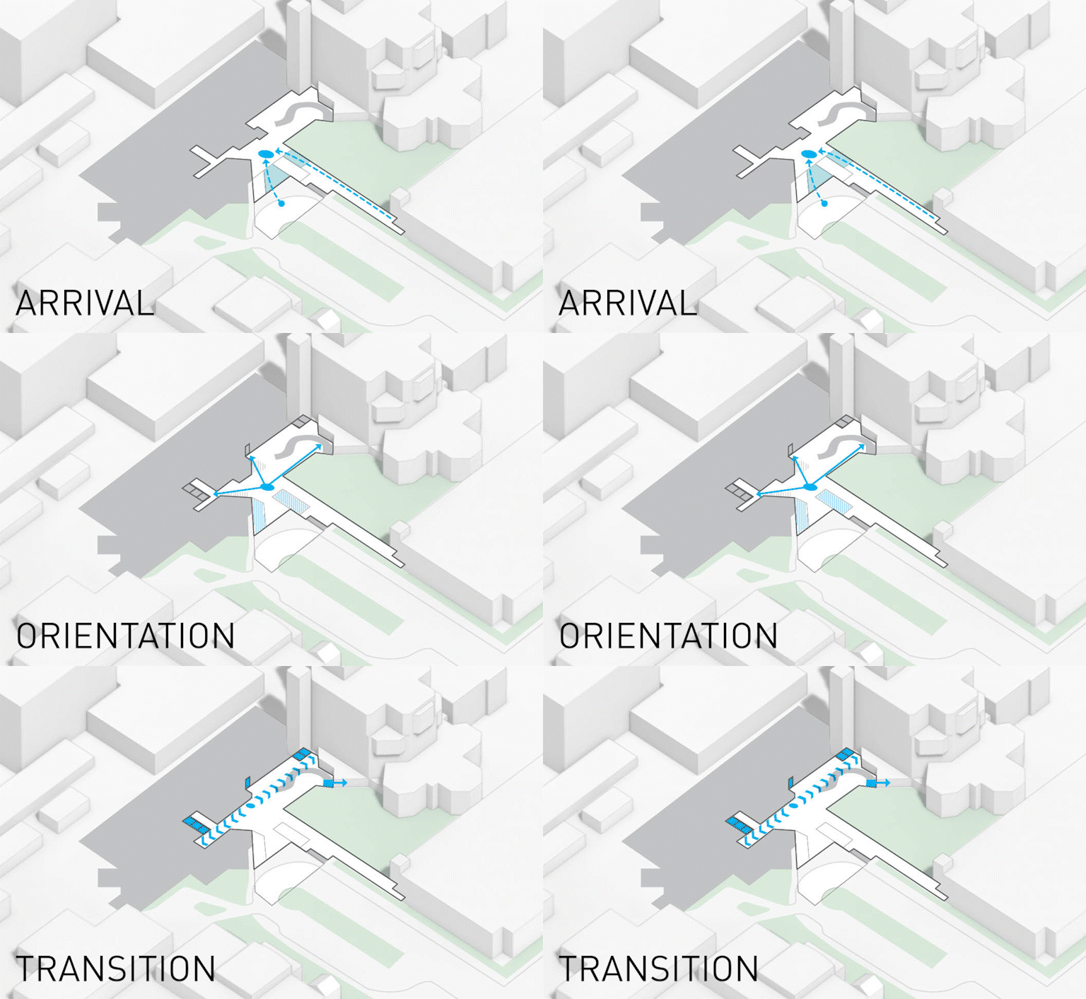 The project carefully considers how people approach the building.
 This is carried through to the interior space, so people can easily see where they need to go next.
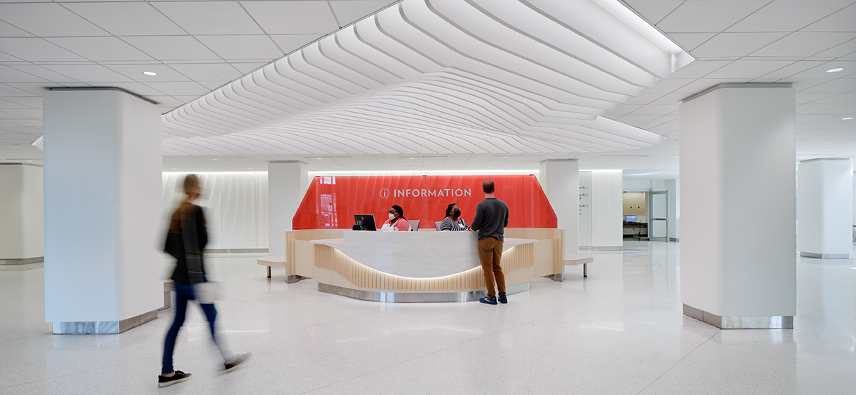 Repeating the canopy pattern above the information desk reinforces the wayfinding message: Go here.
We’re using essential building blocks of design—arrival, orientation, transition— to create intuitive wayfinding: Arrival (where do I go?), orientation (where do I go from here?), and transition (there’s where I go next) to help people navigate the space once they enter the building. More than just empowering people to know where to go, the lobby is designed to be a healthy space that brings them together to connect, collaborate, and convey the story of hope.
-
Awards
-
News
retrofit’s Metamorphosis Awards, Wild Card, 1st Place



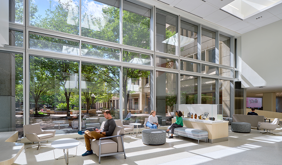 Floor to ceiling windows bring in daylight and provide views to the courtyard.
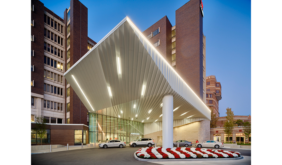 The unique fins of the entry canopy are striking whether viewed up close or from a distance.
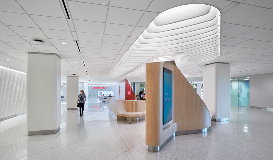 Vertical ceiling fins carry a unique design element through the space.
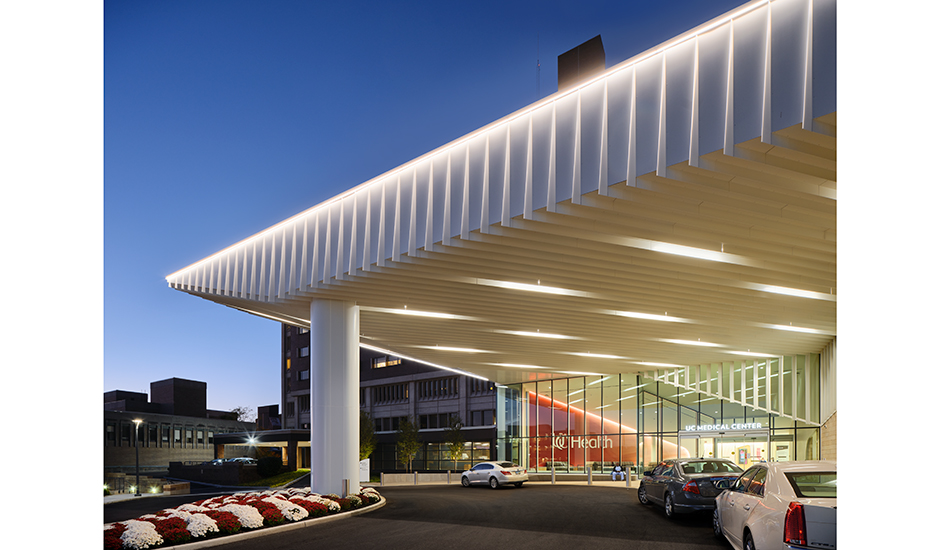 The canopy's structure, fins, and lighting combine to create a beacon at night.
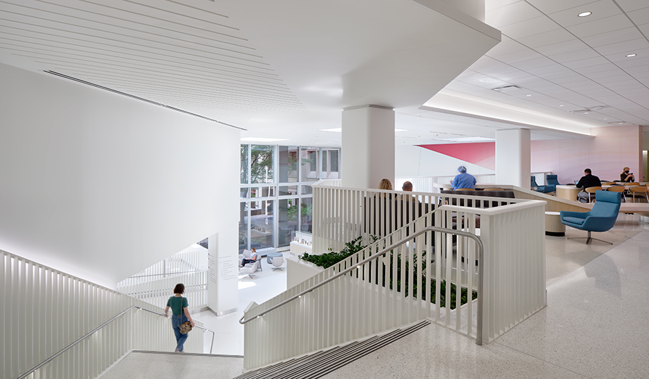 The grand stair encourages movement.
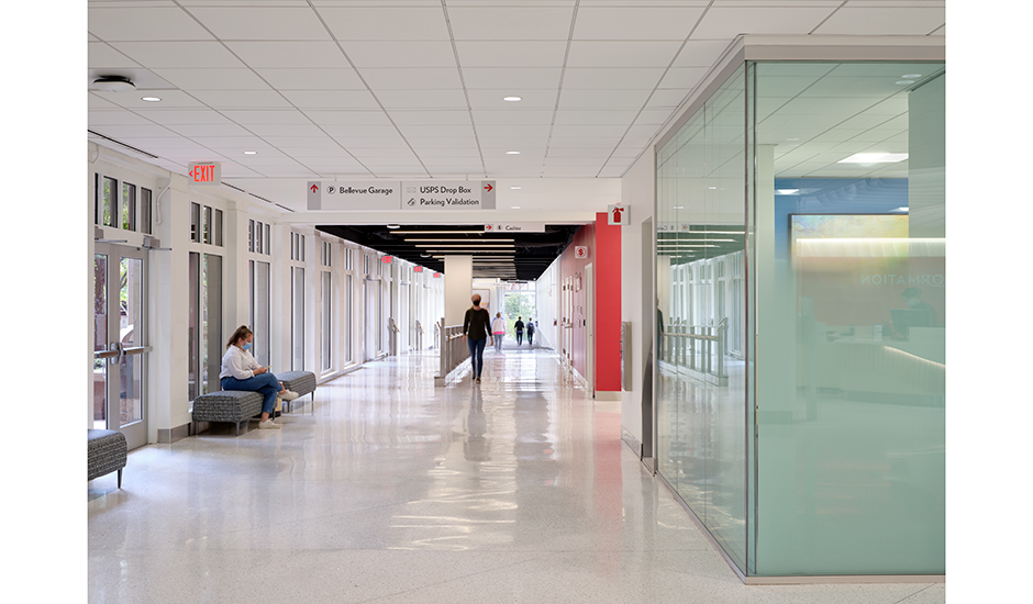 Daylight along and at the ends of corridors aids wayfinding and creates a bright, uplifting journey.
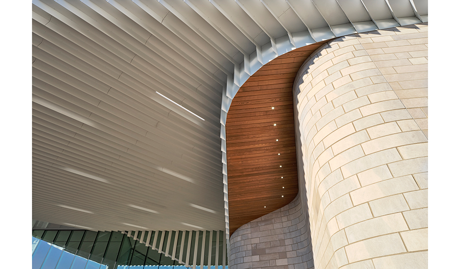 Bent steel, limestone and wood come together harmoniously in the entryway canopy. Inside the lobby, wood accents signify touch points such as the information desk, wayfinding kiosks, and seating.
