Insights
Oct 11, 2022 _ insights
When Life Gives You Lemons: 3 Design Strategies for Turning ‘Problem Sites’ into Lemonade
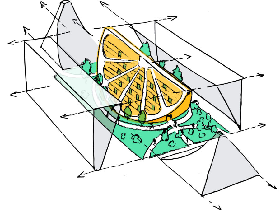
You find sites like this in every city. Their looks and sizes vary, but what they have in common is that they tend to be oddly-shaped, oddly-sized, sited at strange neighborhood edges – or they have site conditions and zoning limits that make it difficult to develop a pro forma multifamily housing project.
With setbacks that produce a strange geometry, these lots can make it difficult to efficiently replicate standard apartment units while maximizing the site’s potential. This frequently results in these sites languishing, ignored and unused, as the city grows up around them.
But where many developers see a problem, some more enterprising developers see opportunity. Unwanted for so long, these ‘problem sites’ are often more readily available and cheaper than their ‘normal’ neighbors. And, with the right strategy, their challenges can generate opportunities for distinctive design elements that make them desirable to tenants and appreciated by neighbors.
In short, given the right conditions—and the right relationship with your designer—it’s possible to turn lemons into lemonade.
To capitalize on the opportunities buried in your site, it’s important to work with designers who are able to clarify your priorities and understand how they play out in space and time. In what follows, I lay out some design strategies that will help you make the most out of your ‘problem site,’ describing how they have worked at other challenging parcels.
Strategy 1: Define the Essentials.

At Fifth & Dinwiddie in Uptown Pittsburgh, we moved the project forward by figuring out how to pair the neighborhood’s vision for development with Bridging the Gap Development’s bold sustainability commitments. The particular challenge of this site was two-fold. It sits on a steep grade, and it has a city street (“Our Way”) that runs through it. This made it challenging to fit all the programmatic elements that the developer, the neighborhood, and the Pennsylvania Housing Finance Authority (PHFA) required without crossing the height threshold that would reclassify the building as ‘high-rise,’ thus requiring a budget-busting structure.
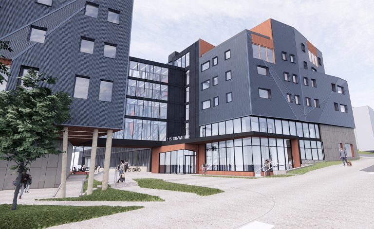
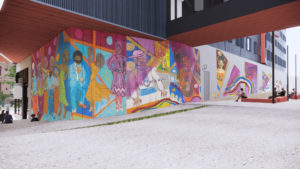
We did this by incorporating a highly efficient stacked parking structure that managed the topography without losing efficiency to internal ramping. By arranging parallel stacks of housing – joined by a bridge that spans “Our Way” – we created a shared plaza that is both intimate and interesting. Dotted with landscape and art elements, a gently meandering ramp also structures the plaza and turns the challenging grade into a placemaking opportunity. Facing Fifth Avenue, the southern building also connects residents and retail to a planned Bus Rapid Transit stop that promises to activate the street.
Strategy 2: Embrace Some Complexity.
 HaNoBe, which is wrapping up construction, is situated in two large, long-vacant former retail sites in College Hill (a first ring suburb of Cincinnati). Given its size and position, this mixed-use development bridges very different neighborhood conditions. Occupying two sides of a busy street at the north end of a bustling neighborhood business district, it creates a gateway for people entering the neighborhood while bringing density to support local businesses. But it also backs up against low-density, mostly single-family homes just off the main drag.
Varied massing and setbacks foster a more engaging and comfortable pedestrian experience along Hamilton Avenue, while shallow door-yards and stoops provide first-floor residents with outdoor space that further enlivens the sidewalk. In order to avoid the increased costs associated with a complicated structure over changing grade, first-floor residences share the same structure and higher ceiling heights as the building’s commercial spaces.
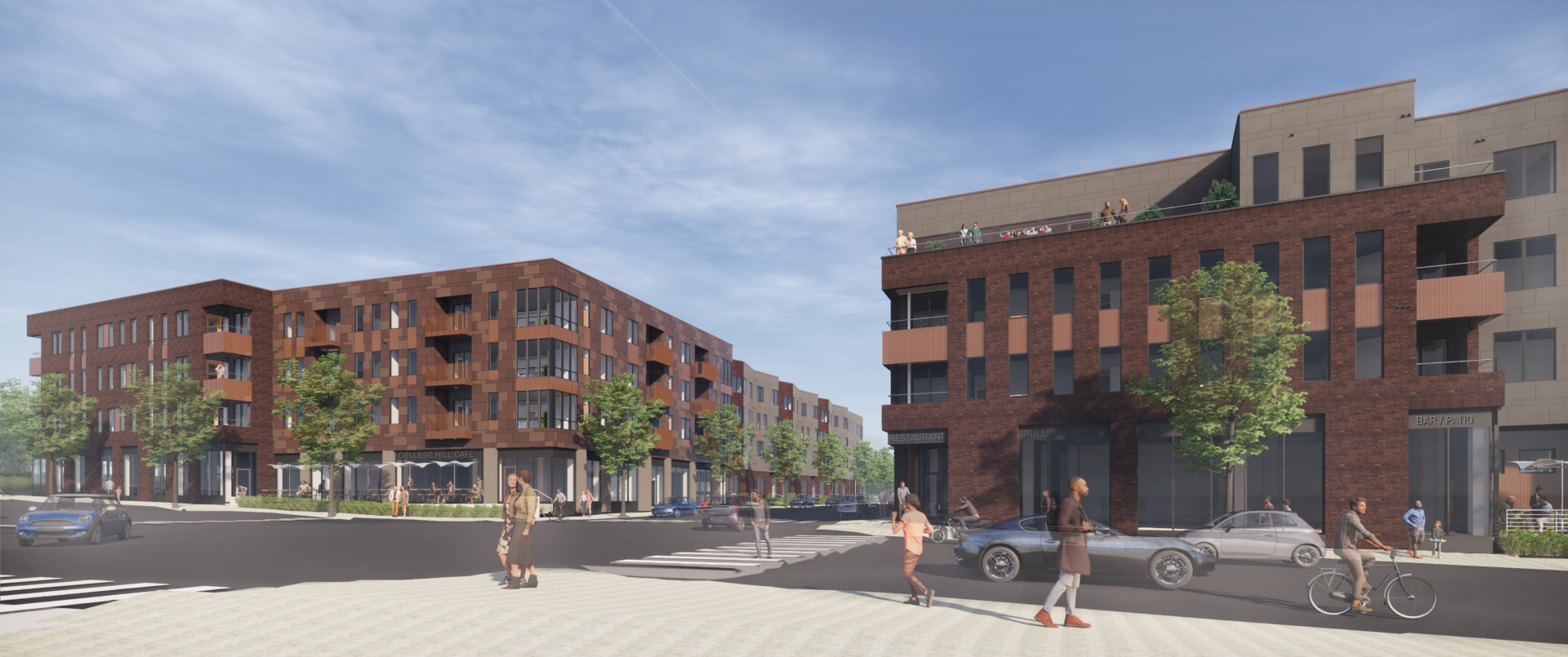
By providing unique apartment sizes and layouts, HaNoBe contributes to the housing ladder for future residents. The variety will help enable them to move and grow into different units without leaving their neighborhood. These units also create unique experiences that residents love. If the development had followed a more traditional approach and maximized the ground floor retail, it would have risked over-building the site and cannibalizing the business district.
Strategy 3: Refine the Edges.
 At Willkommen—a series of mixed-used, mixed-income infill buildings in Cincinnati’s historic Over-The-Rhine neighborhood—we shaped and refined the edges of each building to accomplish different tasks at the urban and unit scales.
The three sites that Willkommen’s infill buildings occupy are tight and dense, but also varied in terms of street level conditions. The design challenge with this project was to create a cohesive design that would engage those conditions while also meeting series of requirements associated with Low-Income Housing Tax Credits (LIHTC), New Market Tax Credits, and the neighborhood’s historic infill guidelines.
Operating in a pro forma manner that simply maxed out the density of these sites was not an option. Instead, we refined the edges of these buildings in an intentional way that enriched the streetscape and created a more comfortable residential experience.
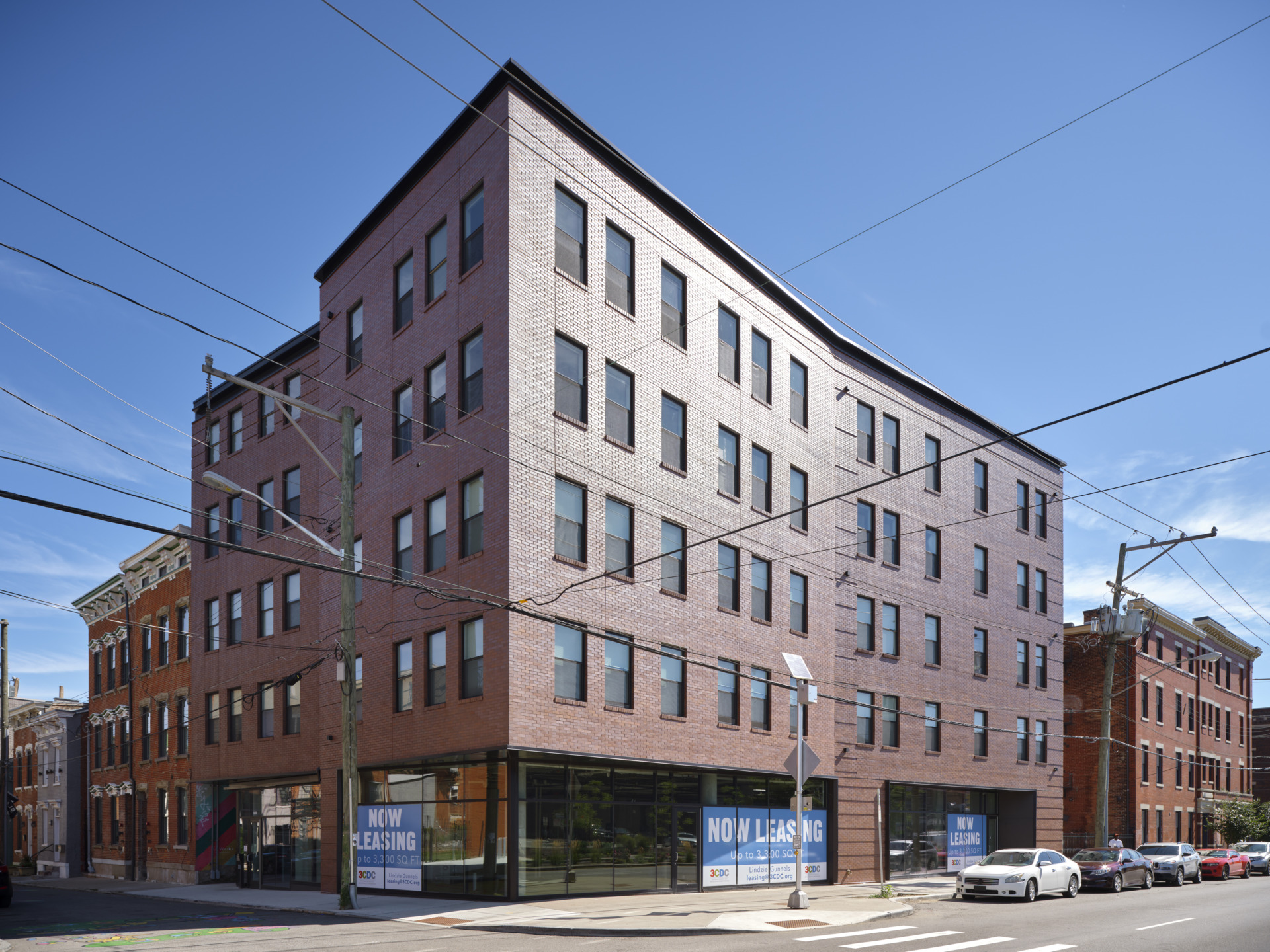
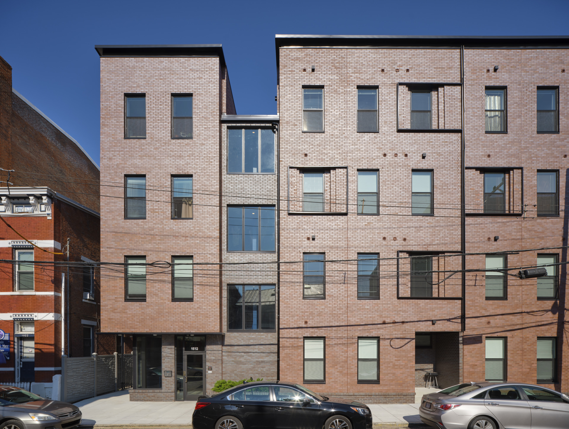
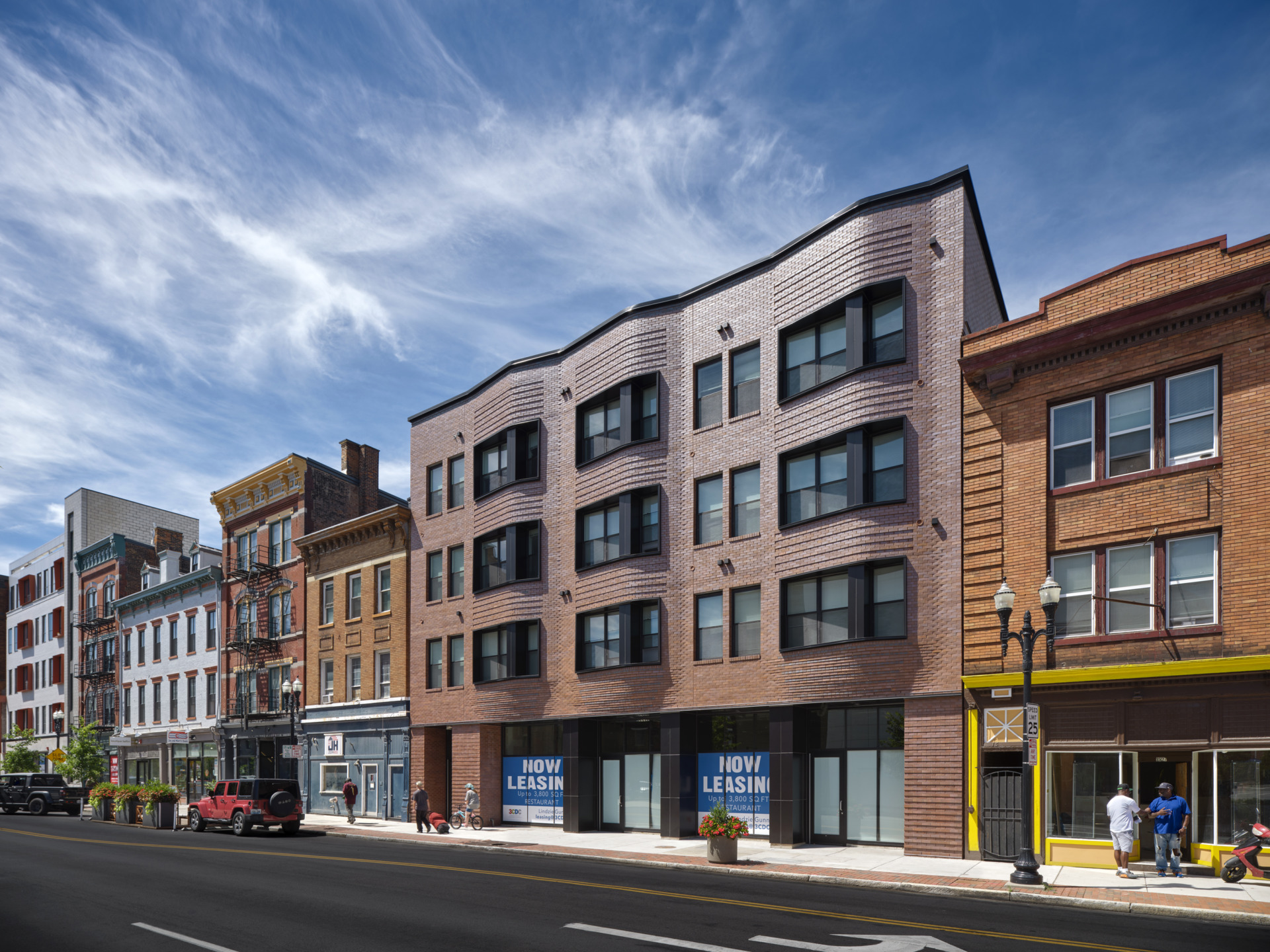
The strategy for each building is determined by its immediate context.
The building on Pleasant Street (above, left), for instance, turns the corner from Liberty Street (a busy, four-lane artery) to a more intimate and smaller-scale street (Pleasant), so its massing steps back to reflect that.
Republic Street (above, middle), on the other hand, is quiet and closed up. Its narrow sidewalks tend to result in people drawing their blinds. So, the building on Republic focuses on fostering presence and activity. It creates a series of more usable porches and windows that make the street feel more occupied.
Willkommen’s Vine Street location couldn’t be more different (above, right). Nestled into a busy street that is filled with retail and restaurants, its distinctive, undulating exterior wall provides a modern take on the neighborhood’s historic oriels. These enrich the pedestrian experience while providing a sort of heft that contributes to the comfort and privacy of the residents above. Its residential door likewise creates that sense of distance and quiet for residents who enjoy using the city as their living room, but don’t really want the city in their living room.
Admittedly, it can take more design work on the front end of the process to make projects economically feasible within their challenging sites. But that investment can be offset by the cost of the site and the savings that good designers are capable of finding when they understand a developer’s budget and priorities. It’s not easy, but with trust and communication, it’s amazing where you can discover opportunity.
Read more about Fifth & Dinwiddie, HaNoBe, and Willkommen.
Blaise is an Associate in GBBN’s Community Development market. Like many architects, a love of studying the world through drawing led Blaise to architecture. But his deft integration of bold ideas, strategy, and technique set him apart as a designer. From concept to construction, Blaise has helped deliver many successful multifamily projects, including Willkommen, Hisle Park Apartment, and HaNoBe.
